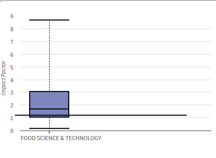
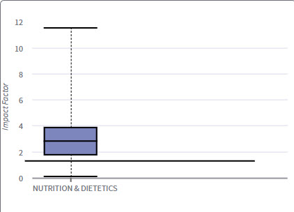
Category Box Plot
The Category box plot depicts the distribution of Impact Factors for all journals in the category. The horizontal line that forms the top of the box is the 75th percentile (Q1). The horizontal line that forms the bottom is the 25th percentile (Q3). The horizontal line that intersects the box is the median Impact Factor for the category. Box plots are provided for each category in which the journal is indexed.
Horizontal lines above and below the box, called whiskers, represent maximum and minimum values.
The top whisker is the smaller of the following two values:
Maximum Impact Factor (IF)
Q1 IF + 3.5(Q1 IF - Q3 IF)
The bottom whisker is the larger of the following two values:
Minimum Impact Factor (IF)
Q1 IF - 3.5(Q1 IF - Q3 IF)
Box Plots are provided for the current JCR year for each of the categories in which the journal is indexed. The below box plots represent each of the categories in which Critical Reviews in Food Science and Nutrition is indexed.


As we can see from the horizontal bars in the examples, Critical Reviews in Food Science and Nutrition, with its Impact Factor of 1.22 sits at or near the top of the 1st quartile in the category of Food Science &Technology. In the category of Nutrition & Dietetics, the journal's impact factor is again located in the 1st quartile.
Special Note: We thank Marie-Helene Magri of the Institut National de la Recherche Agronomique (INRA) for proposing the use of her application of the box plot concept to Journal Citation Reports as a method of visualizing journal performance across disciplines. For a more in-depth description of the use of this approach, please see Magri, M.-H. and Solari, A. 1996. The SCI journal citation reports: a potential tool for studying journals? Scientometrics 35: 93–117. dx.doi.org/10.1007/BF02018235
